PrésentatIon Powerpoint
Présentation JOAN pour Acceprint by Pokeslide
Réalisation de l’identité visuelle JOAN, de son Powerpoint, motion design de présentation, habillage de stand.
La société ACCEPRINT, fililale de nehs – groupe délivrant services et solutions pour les professionnels de santé, a fait appel à l’agence Pokeslide pour la création du branding de JOAN et de ses supports de communication print et vidéo.
Création du motion design JOAN
Création du logo JOAN
Joan est une solution d’impression et de gestion des documents au sein des établissements de santé. Le nom Joan fait référence à Johannes Gutenberg célèbre inventeur de l’imprimerie. Le logo associe donc typographie moderne et caractère d’imprimerie. Le O qui forme un cercle parfait connote la globalité du service. Le point en marge du J témoigne de la valeur ajoutée apportée par la solution JOAN à ses clients.
Une présentation ludique et désasseptisée
L’univers graphique créé pour Joan tire parti de la forme cerclée de son logo et de ses couleurs.
On retrouve ainsi des cercles entourant les pictogrammes, habillant le fond des slides afin de leur donner de la profondeur.
Les formes rondes sont bienveillantes et joyeuses. Elles prennent le contrepied graphique des codes traditionnels austères des solutions informatiques.
Cette gaité est renforcée par un univers coloriel aux tonalités pastel réchauffant et adoucissant la chromie liée au milieu médical.
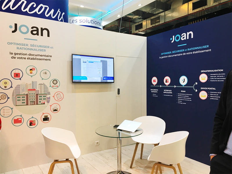
Design et habillage du stand
Le travail de déclinaison de l’identité visuelle de JOAN a été approfondie pour créer l’habillage du stand utilisé lors de la Paris Healthcare Week afin de présenter le concept de la solution. Le choix d’explications simplifiées en infographies donne de la continuité au discours des commerciaux, et met en immersion le visiteur dans l’univers de la marque en l’interpellant positivement.
Autres réalisations Powerpoint

Powerpoint Éditeur de Jeux video

Powerpoint Cabinet conseils immobilier

Powerpoint Agence de communication

Powerpoint Services Techniques
ENVIE DE NOUS CONFIER UN PROJET ?
CONTACTEZ-NOUS !
POKESLIDE – L’agence Powerpoint
13 Boulevard Saint Germain
75005 Paris
bonjour@pokeslide.com
+33 9 81 36 70 46

